Posts

Gradient Last Name

Image
  I created this background by creating my own pattern brush, in a new photoshop file I took a flower pattern and then colored it with the colors I wanted it to be. Then I uploaded that file as a pattern brush. Then within a different new project I used the pattern I created and make it into a background. After that I then create my last name "Lin" through text and colored it to a lighter color. Lastly I copied that text and recolored it to a darker color and moved it downwards to create a 3D effect within my last name.

MP2 My AP classes / College Artboard.

Image
This Art board consist of a collection of colleges I applied to, and some of which that I got into. I created this art board by first finding the logos of the colleges I applied to then I sorted them for the horizontal art board by 3s and took out my first pick art board so it can stand out and added an description of why I chose this art board to fill in white space. The vertical art board I have less space to work with, so I had to make the logos smaller and then line them up in one line and then place my first pick next to them. This is how I created my two art board.

School Event Project

Image
The subject of my poster is A man singing in the center of the poster. The slogan I used was "Come to the Talent Show To Witness a Spectacular Performance Now!" So I can advertise the talent show, so more people would be more willing to come. My poster has two color layers, blue and purple, that was created by overlaying a man subject. I also have another text box to describe what the man was doing to describe the a part of the talent show, which is singing. Finally I added fireworks and a black background to enhance my poster.

Alter Text Name Project

Image
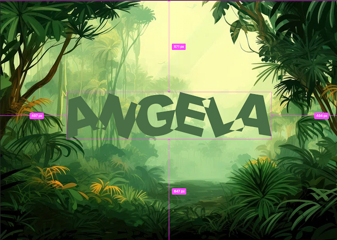
  I first found a background, which I chose as a forest. Then I wrote my name, Angela, with regular text and then after I used the alter text method which was shown in the tutorial to transform and adjust my name and text so it would look like the alter text tutorial.

Climate Strike Poster Project

Image
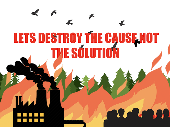
  Graphic Layer 1= On the first couple of layers I was adding all the images I needed to make the poster, I erased and overlapped some of the images so that they would fit together perfectly. Text Layer 2=   For the text layer I made the text around size 60 and made it really red to highlight the text in contrast to the image itself. Then I saw that the text was either blocking or being blocked by my images. So I erased some of the image parts and put some layers above the text layer so nothing would overlap. Overall design reflection: (which text method did you use for your flyer screenshot of your final design. I used the text method that puts a text over images and erasing parts so the text wouldn’t overlay my pictures.
Image
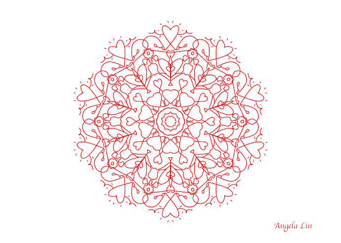
  For this project, I designed a mandala by first opening a new file in Photoshop. I then selected the mandala tool and customized the design to create the desired mandala. I also wrote my name on the bottom using text to indicate my name.

Selfie Collage Project

Image
  Layer 1= Layer one I sorted the layers so a layer that Isn’t transparent wouldn’t overlay another picture, so I placed pictures layers above that one. Layer 2= I changed the hue of the layer and I resized the layer so I can make the shape of a heart. Layer 3= I used the selection tool to change the color of certain parts of my picture within that layer. Layer 4= I used a tool to create an effect that the picture is somewhat transparent to bring out the photo and layer. Layer 5= I changed the colors of a certain color within the layer to something else. Overall design reflection: (what was easy / hard for you to do?) screenshot of your final design.0 What was easy is to use the selection and layering tools because they are easy to do and easy to remember. But the other functions like making transparency within the layers or changing the hues of certain subjects and colors were difficult.